[Case 01]
Streamlining Docs Portal +40% Efficiency
Cybersecurity
Redesigning BlackBerry's Developer Documentation Portal
Modernized the enterprise docs portal at BlackBerry — used daily by thousands of developers, IT administrators, and security professionals across 15+ products — improving navigation, information architecture, and brand credibility from the ground up.
[Industry]
Cybersecurity
[My Role]
Lead Product Designer
[Platforms]
Figma, V0
[Timeline]
Sprint
Sept 2025
15+ enterprise products reorganized under a unified IA
1,000+ developers, IT admins and security professionals served daily
Zero-budget redesign delivered through expert heuristics and competitive benchmarking
[The Challenge]
BlackBerry's Docs Portal Was Failing Its Users.
BlackBerry's developer documentation portal — relied on daily by thousands of enterprise professionals to integrate products, troubleshoot issues, and maintain security systems — had not been meaningfully updated in over a decade. The dated design undermined brand credibility for one of the world's most recognized cybersecurity names. More critically, poor information architecture made it genuinely difficult for technical users to find what they needed, likely driving up support costs and frustrating the very people BlackBerry depends on. With a tight delivery window and no budget for user research, the challenge was to make high-impact decisions fast.
[The Solution]
A Modern, Credible, Enterprise-Ready Experience.
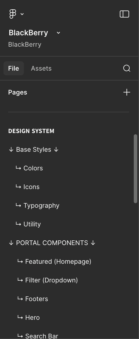
I ran a rapid expert heuristic evaluation against Nielsen's 10 usability principles and benchmarked four leading enterprise documentation portals to establish design direction quickly. From there I built a complete design system from scratch — modernizing the visual language, restructuring the information architecture across 15+ products, and advocating for UX best practices under real stakeholder constraints. The result is a documentation experience that finally matches BlackBerry's enterprise reputation.

[Process]
[01] Strategic Prioritization
Conducted heuristic evaluation against Nielsen's 10 usability principles
Identified critical usability violations in the existing portal.
Benchmarked 4 leading enterprise documentation portals for standards and patterns
[02] Insights
Decade-old visual design was actively undermining BlackBerry's enterprise credibility
Center-aligned content violated F-pattern reading behavior for technical users
Flat visual hierarchy made scanning and wayfinding unnecessarily difficult
[03 Design Solution]
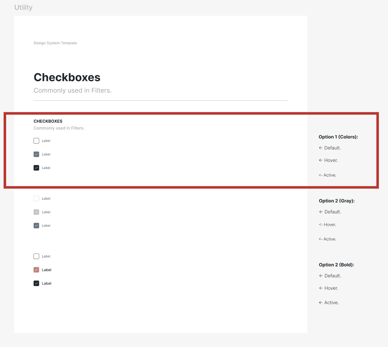
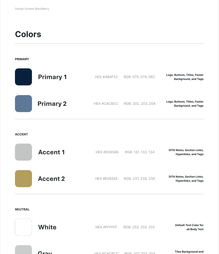
Built a modern design system with a refined navy and gold palette aligned to brand
Introduced bold typography, clear spacing, and card-based hierarchy for fast scanning
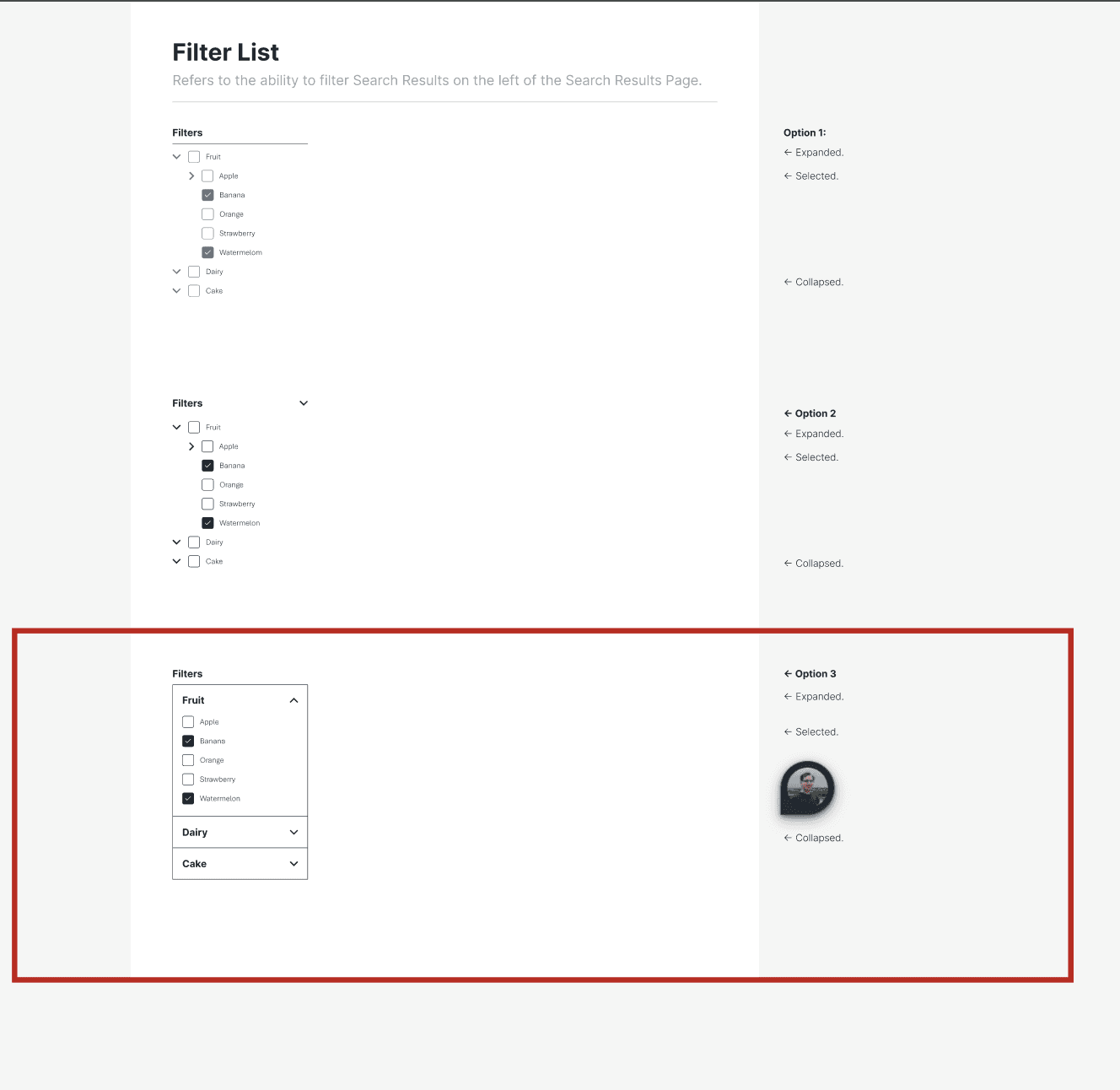
Reorganized 15+ diverse products into logical, clearly labeled categories
[04] UX Advocacy Under Constraints
Advocated for F-pattern left-aligned layout based on established eye-tracking research
When stakeholders opted for centered layout for brand consistency, adapted the strategy
Compensated through strengthened typography hierarchy and spatial rhythm to preserve usability
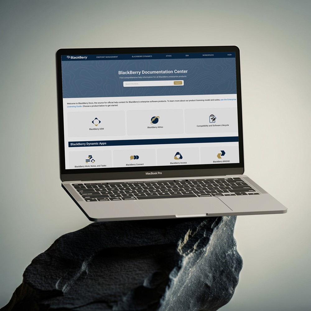
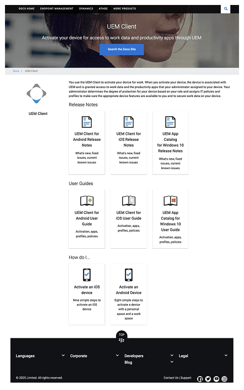
[Before]
[After]
[Key Decisions]
Ruthless Scope Management
With a tight delivery window, I focused exclusively on the highest-leverage fundamentals: visual modernization, information architecture, and a scalable design system. Everything that wouldn't directly serve BlackBerry's technical users was cut.
Visual Credibility First
Enterprise users judge a product's trustworthiness before they read a single word. A refined navy and gold palette, professional typography, and structured card design immediately signal that this is a platform that takes security professionals seriously.
Structure That Scales
Reorganizing 15+ products into clear, logical categories with prominent search wasn't just a design decision — it was a business one. Technical answers that take seconds to find instead of minutes reduce friction, support costs, and user frustration across thousands of daily sessions.
[Outcome]
A Foundation for Credibility and Scale.
The redesign was delivered on time with full client satisfaction. Beyond aesthetics, the work addressed a structural problem: a documentation portal that didn't reflect the quality or reputation of the brand it represented. By combining rigorous IA with a scalable design system, the new portal positions BlackBerry as the credible enterprise leader it is — and gives thousands of developers the clarity they need to do their jobs.

Want to hear the full story?
I can walk you through the research process, stakeholder decisions, and design trade-offs in detail.
[Case 01]
Streamlining Docs Portal +40% Efficiency
Cybersecurity
Redesigning BlackBerry's Developer Documentation Portal
Modernized the enterprise docs portal at BlackBerry — used daily by thousands of developers, IT administrators, and security professionals across 15+ products — improving navigation, information architecture, and brand credibility from the ground up.
[Industry]
Cybersecurity
[My Role]
Lead Product Designer
[Platforms]
Figma, V0
[Timeline]
Sprint
Sept 2025
15+ enterprise products reorganized under a unified IA
1,000+ developers, IT admins and security professionals served daily
Zero-budget redesign delivered through expert heuristics and competitive benchmarking
[The Challenge]
BlackBerry's Docs Portal Was Failing Its Users.
BlackBerry's developer documentation portal — relied on daily by thousands of enterprise professionals to integrate products, troubleshoot issues, and maintain security systems — had not been meaningfully updated in over a decade. The dated design undermined brand credibility for one of the world's most recognized cybersecurity names. More critically, poor information architecture made it genuinely difficult for technical users to find what they needed, likely driving up support costs and frustrating the very people BlackBerry depends on. With a tight delivery window and no budget for user research, the challenge was to make high-impact decisions fast.
[The Solution]
Modern, Professional, Enterprise-Ready.
I ran a rapid expert heuristic evaluation against Nielsen's 10 usability principles and benchmarked four leading enterprise documentation portals to establish design direction quickly. From there I built a complete design system from scratch — modernizing the visual language, restructuring the information architecture across 15+ products, and advocating for UX best practices under real stakeholder constraints. The result is a documentation experience that finally matches BlackBerry's enterprise reputation.
[Process]
[01] Strategic Prioritization
Conducted heuristic evaluation against Jakob Nielsen's 10 usability principles
Analyzed existing portal to identify critical usability violations
Benchmarked 4 leading documentation portals for industry standards
[02] Insights
Dated design undermined enterprise credibility and brand trust
Center-aligned content violated F-pattern reading behavior
Weak visual hierarchy made information difficult to scan quickly
[03 Design Solution]
Established modern design system with navy blue + gold palette
Implemented bold typography and generous spacing for hierarchy
Reorganized 15+ diverse products into clear, logical categories
[04] UX Advocacy Under Constraints
Advocated strongly for F-pattern left-aligned layout based on eye-tracking research
When stakeholders preferred center-aligned for brand consistency, pivoted strategy
Compensated with typography, visual hierarchy, and spacing to maintain usability
[Before]
[After]
[Key Decisions]
Strategic Prioritization
With only 2 days, I focused on high-impact fundamentals: visual modernization, information architecture, and scalable design system—ruthlessly cutting anything that didn't directly serve enterprise users.
Visual Transformation
Navy blue and gold palette, bold typography, generous spacing, and professional card design instantly restored enterprise credibility while maintaining brand guidelines.
Clear Product Organization
Reorganized 15+ products into logical categories with prominent search functionality, making technical answers findable in seconds instead of minutes.
[Outcome]
A Foundation for Credibility and Scale.
The redesign was delivered on time with full client satisfaction. Beyond aesthetics, the work addressed a structural problem: a documentation portal that didn't reflect the quality or reputation of the brand it represented. By combining rigorous IA with a scalable design system, the new portal positions BlackBerry as the credible enterprise leader it is — and gives thousands of developers the clarity they need to do their jobs.
Want to hear the full story?
I can walk you through the research process, stakeholder decisions, and design trade-offs in detail during a conversation.
[Case 01]
Streamlining Docs Portal +40% Efficiency
Cybersecurity
Redesigning BlackBerry's Devs Documentation Portal
Modernized the enterprise docs portal at BlackBerry — used daily by thousands of developers, IT administrators, and security professionals across 15+ products — improving navigation, information architecture, and brand credibility from the ground up.
[Industry]
Cybersecurity
[My Role]
Lead
Product Designer
[Platforms]
Figma, V0
[Timeline]
2 Days
Sept 2025
15+ enterprise products reorganized under a unified IA
1,000+ developers, IT admins and security professionals served daily
Zero-budget redesign delivered through expert heuristics and competitive benchmarking
[The Challenge]
BlackBerry's Docs Portal Was Failing Its Users.
BlackBerry's developer documentation portal — relied on daily by thousands of enterprise professionals to integrate products, troubleshoot issues, and maintain security systems — had not been meaningfully updated in over a decade. The dated design undermined brand credibility for one of the world's most recognized cybersecurity names. More critically, poor information architecture made it genuinely difficult for technical users to find what they needed, likely driving up support costs and frustrating the very people BlackBerry depends on. With a tight delivery window and no budget for user research, the challenge was to make high-impact decisions fast.
[The Solution]
Modern, Professional, Enterprise-Ready.
I ran a rapid expert heuristic evaluation against Nielsen's 10 usability principles and benchmarked four leading enterprise documentation portals to establish design direction quickly. From there I built a complete design system from scratch — modernizing the visual language, restructuring the information architecture across 15+ products, and advocating for UX best practices under real stakeholder constraints. The result is a documentation experience that finally matches BlackBerry's enterprise reputation.
[Process]
[01] Strategic Prioritization
Conducted heuristic evaluation against Jakob Nielsen's 10 usability principles
Analyzed existing portal to identify critical usability violations
Benchmarked 4 leading documentation portals for industry standards
[02] Insights
Dated design undermined enterprise credibility and brand trust
Center-aligned content violated F-pattern reading behavior
Weak visual hierarchy made information difficult to scan quickly
[03] Design Solution
Established modern design system with navy blue + gold palette
Implemented bold typography and generous spacing for hierarchy
Reorganized 15+ diverse products into clear, logical categories
[04] UX Advocacy Under Constraints
Advocated strongly for F-pattern left-aligned layout based on eye-tracking research
When stakeholders preferred center-aligned for brand consistency, pivoted strategy
Compensated with enhanced typography, visual hierarchy, and spacing to maintain usability
[Before]
[After]
[Key Decisions]
Strategic Prioritization
With only 2 days, I focused on high-impact fundamentals: visual modernization, information architecture, and scalable design system—ruthlessly cutting anything that didn't directly serve enterprise users.
Visual Transformation
Navy blue and gold palette, bold typography, generous spacing, and professional card design instantly restored enterprise credibility while maintaining brand guidelines.
Clear Product Organization
Reorganized 15+ products into logical categories with prominent search functionality, making technical answers findable in seconds instead of minutes.
[Outcome]
A Foundation for Credibility and Scale.
The redesign was delivered on time with full client satisfaction. Beyond aesthetics, the work addressed a structural problem: a documentation portal that didn't reflect the quality or reputation of the brand it represented. By combining rigorous IA with a scalable design system, the new portal positions BlackBerry as the credible enterprise leader it is — and gives thousands of developers the clarity they need to do their jobs.
View the live portal →
Want to hear the full story?
I can walk you through the research process, stakeholder decisions, and design trade-offs in detail during a conversation.